
 Web Graphics and Icon Design
$389.00
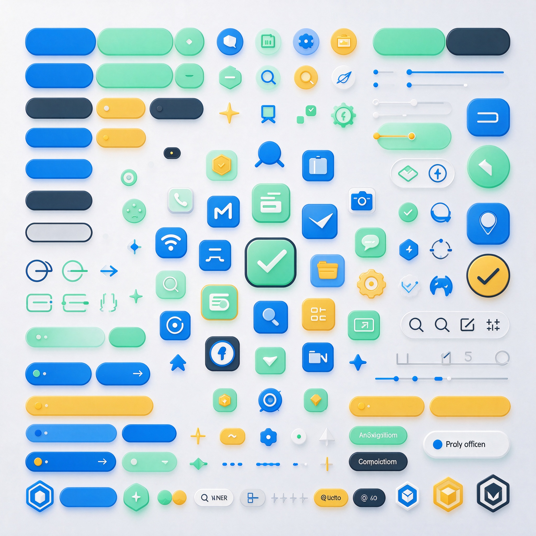
We provide design services for graphical elements and icon systems used in web interfaces—including functional icons, navigation icons, button graphics, background textures, decorative shapes, dividers, prompt graphics, and empty-state illustrations—ideal for projects that require a cohesive visual language and refined graphical details. The design process begins by establishing a consistent visual style—defining parameters such as line-based or solid-fill aesthetics, corner radii, stroke weights, whitespace ratios, and visual weight—followed by the creation of standardized drawing rules. Icons are developed to cover common functions and page scenarios, all adhering to a unified grid, stroke width, and corner-rounding logic. Decorative elements are designed for specific applications, such as page backgrounds, section dividers, title accents, and content highlighting. All assets are provided in various sizes and color variations, with clear specifications for visual states—such as clickable, non-clickable, selected, and hover states. Our collaborative workflow includes auditing graphical requirements, defining the stylistic direction, designing core assets, expanding the icon system, and compiling comprehensive design specifications for final delivery. Deliverables include icon sets, graphical assets, sizing and color guidelines, usage instructions, and state-specific styles—complete with annotations for dimensions, whitespace, alignment, color values, and usage constraints—ensuring seamless implementation by the development team. By ensuring stylistic consistency, high legibility, reliable scaling, standardized color usage, and clear state transitions, we eliminate visual fragmentation and stylistic inconsistency. This creates a unified visual language across navigation, buttons, prompts, and decorative elements, enhancing the overall polish and structural order of the interface.
Web Graphics and Icon Design
$389.00