

 Web Visual Style Guides and Co...
$249.00
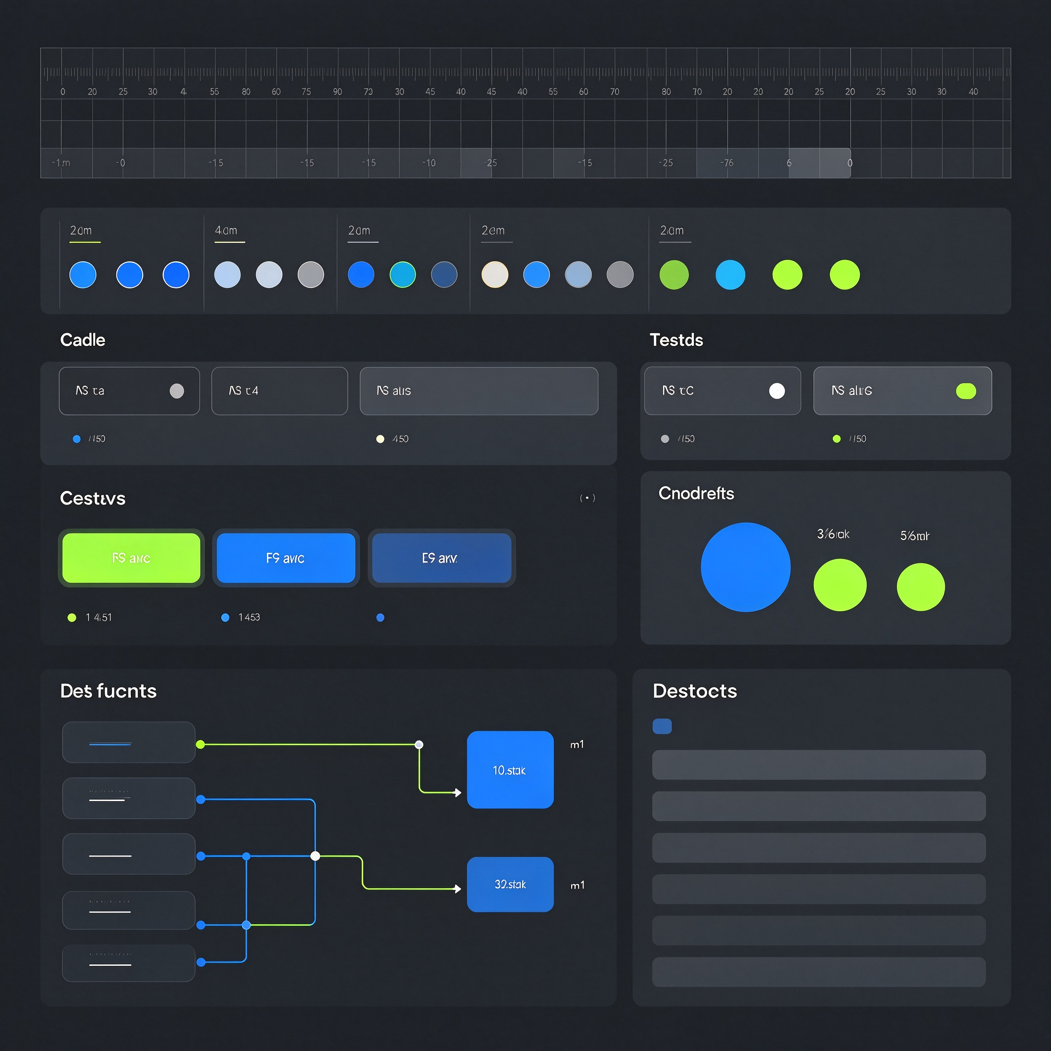
Provides web page visual specifications and common component visual design, including color specifications, font levels, spacing rules, rounded corners and shadow rules, buttons, forms, cards, navigation, labels, prompts, pop-ups, tables, paging and other component styles. It is suitable for projects that need to unify page visual rules and improve the efficiency of multi-person collaboration. When designing, first sort out the elements that appear frequently on the page and establish unified size, spacing, color and font rules. Then define visual states such as default, hover, selected, disabled, and prompt for components. Standardize the use of titles, text, and auxiliary text at different levels, as well as the spacing relationship between page blocks. Component examples cover common combination scenarios to help page producers understand how to maintain unity in different content. The process includes page element inventory, specification framework establishment, core component design, status supplement, specification organization and delivery. The delivered content includes visual specification manual, component visual library, status description, spacing annotation and usage examples, and provides clear annotations and usage instructions, lists reusable rules and how to handle special situations, and organizes component naming logic and classification methods for page systems that require long-term maintenance. Quality points include clear rules, complete component status, unified spacing system, hierarchical use of colors, and easy implementation of specifications. Organize scattered page elements into reusable visual rules to reduce repeated designs and style deviations, enable new pages to quickly apply unified standards, and improve visual consistency during team collaboration.
Web Visual Style Guides and Co...
$249.00