
 High-Conversion Landing Page V...
$349.00
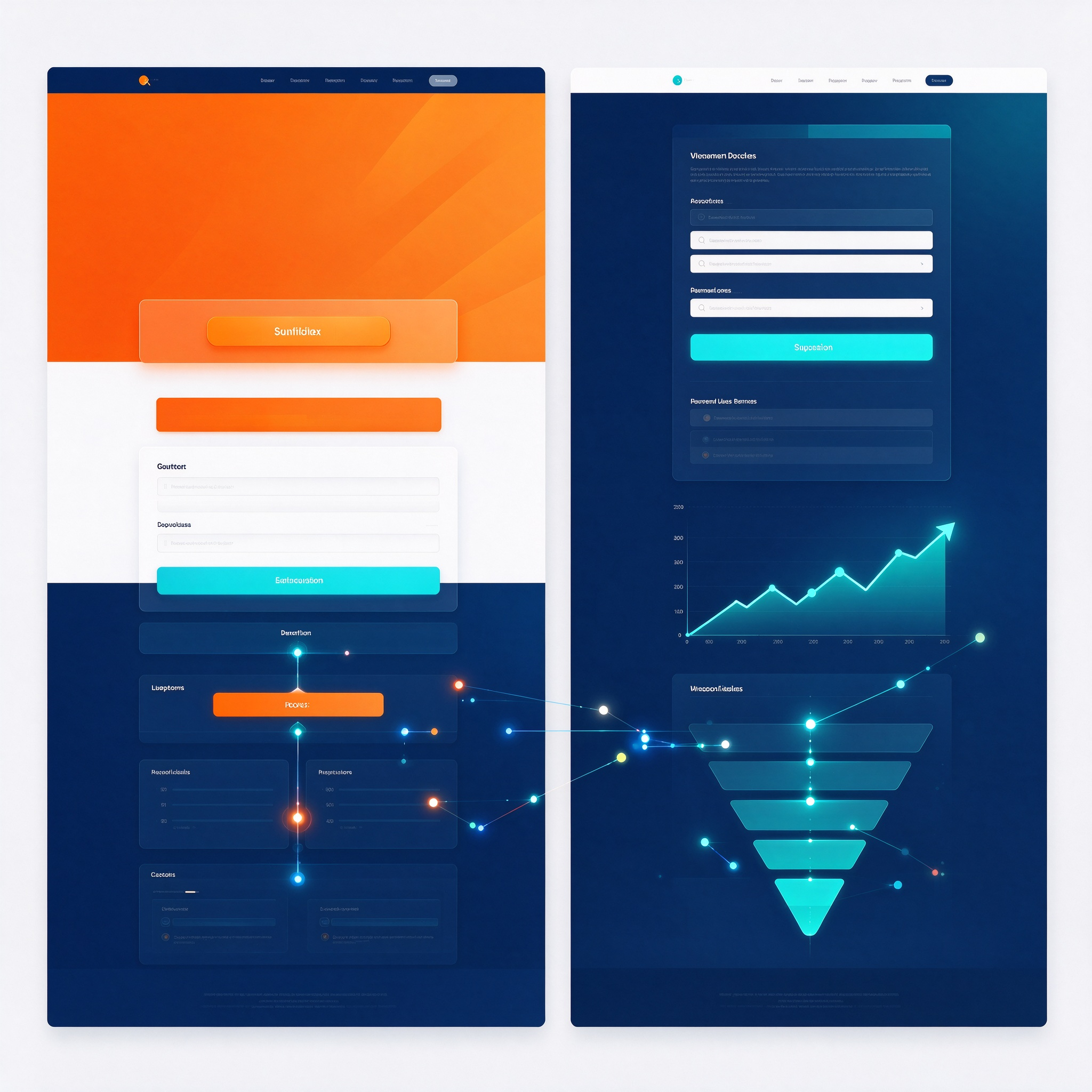
Focusing on the visual hierarchy and information guidance of landing pages, this approach utilizes the design of the “above-the-fold” hero section, key selling points, social proof/evidence, calls-to-action (CTAs), forms, and the overall scrolling rhythm to ensure visitors quickly grasp the page’s core message. It is ideal for product showcases, service descriptions, event registrations, lead magnet downloads, and any other pages requiring clear visual direction. The design process begins by prioritizing information—defining the relationship between the primary headline, supporting text, hero imagery, and CTAs—before establishing a logical reading flow for subsequent sections. Visual elements such as font sizing, paragraph width, image-to-text ratios, color contrast, button prominence, form field layout, prompt styling, and whitespace are carefully managed to guide visitors through the content in the intended sequence. For content-heavy pages, techniques like sectioning, graphical cues, and visual dividers are employed to reduce cognitive load. The collaboration workflow encompasses requirements gathering and content structuring, defining the visual direction, designing the hero section, developing the full page layout, ensuring mobile responsiveness, and preparing final assets for delivery. Deliverables include the hero section design, modular section layouts, button and form states, mobile-optimized designs, and guidelines for component reuse—complete with specifications for spacing, image cropping, interactive states, and responsive behavior. Key quality criteria include a clear focus above the fold, a well-defined information hierarchy, highly recognizable buttons and forms, a consistent scrolling rhythm, and a seamless mobile reading experience. Through intentional visual design, the page establishes a clear browsing sequence, minimizes distractions, highlights core content, and maintains a cohesive overall style.
High-Conversion Landing Page V...
$349.00